Welcome.
🎨 DO YOUR PRESENTATION SLIDES HELP YOUR MESSAGE — OR DISTRACT FROM IT?
You know what you want to teach. You know your subject.
But then you open Canva or PowerPoint… and suddenly you’re trying to decide:
What must go on the slide?
How much text is too much?
Where should I place the images?
Which colours should I use?
Why does my presentation still look cluttered?
I see this often with webinars, courses and online presentations.
And here's something I've learned through painting:
Good composition guides the eye.
The same principle applies to a presentation.
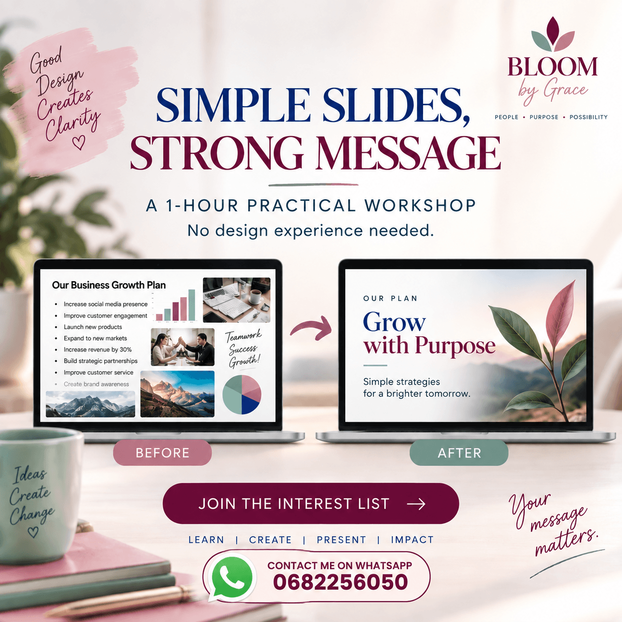
I'm putting together a practical 1-hour Practical Workshop for course creators, digital marketers, coaches and anyone creating presentations who wants to learn how to:
✓ Simplify cluttered slides
✓ Create a clear focal point
✓ Use colour with purpose
✓ Position text and images more effectively
✓ Use space instead of filling every corner
✓ Create a professional, consistent look
✓ Make your slides SUPPORT your message instead of competing with it
This won't be a complicated graphic-design course.
I'll show you simple principles from art and composition that you can apply to your own presentations — even if you don't consider yourself creative or a designer.
I'm planning my first small group now and would love to see who is interested before I set the date.
👉 Want to join the first round? [LINK BELOW]
No date commitment yet — you'll simply be first to hear when I open the workshop.
Your message matters. Let your slides help people see it.